



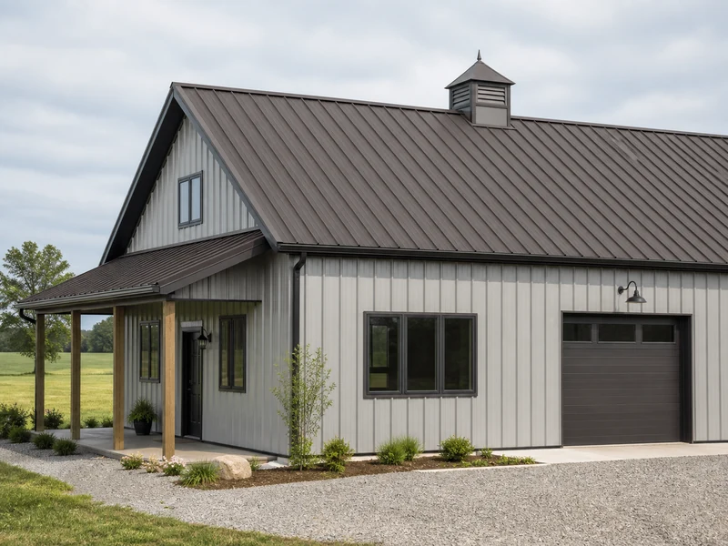
Burnished Slate is a warm, dark gray-brown, and the colors that match it fall into three dependable directions. Light neutrals like white, cream, beige, and light gray give crisp high contrast. Warm earth tones like taupe and saddle brown create a softer, tone-on-tone look. Deep charcoal, black, or navy make a bold, modern statement. On a metal building you are rarely matching a single color. You are coordinating Burnished Slate across the roof, walls, trim, and wainscot, so the real question is which direction fits the look you want and how much contrast the building can carry.
This guide sorts the matching colors by the result they produce, then shows how to place them on an actual metal building without ending up with a flat or muddy scheme.
Is Burnished Slate Brown or Gray? Start With the Undertone
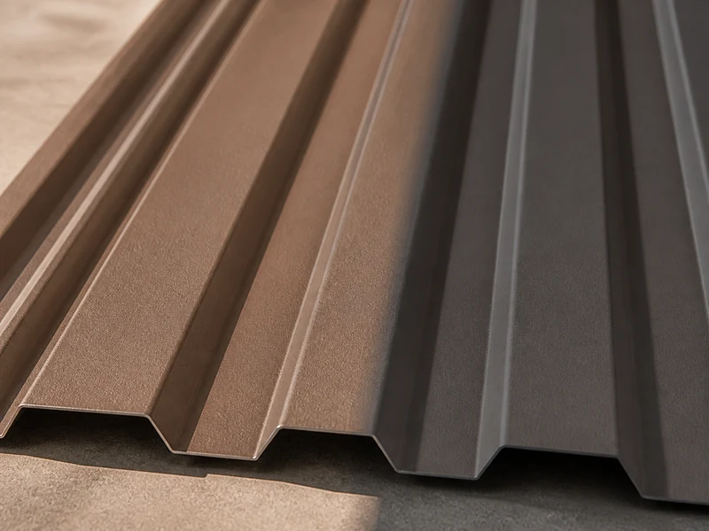
Burnished Slate reads as a warm, dark gray-brown rather than a true brown or a true gray. The slate part of the name points to its muted, stony depth, while the burnished part hints at the brown warmth underneath. On a finished panel it usually looks browner than the small swatch suggests, especially in direct sun, because the brown pigment reads stronger at full scale than it does on a chip.
That mixed undertone is why Burnished Slate is so flexible. The gray side lets it sit comfortably next to cool colors like charcoal and crisp white, and the brown side lets it blend with warm colors like tan and taupe. Before you choose anything else, decide which way you want to lean. A cool pairing keeps the building looking sharp and contemporary, while a warm pairing makes it feel earthy and settled. Trying to do both at once usually leaves the scheme looking unresolved.
Light Neutral Colors That Pair With Burnished Slate
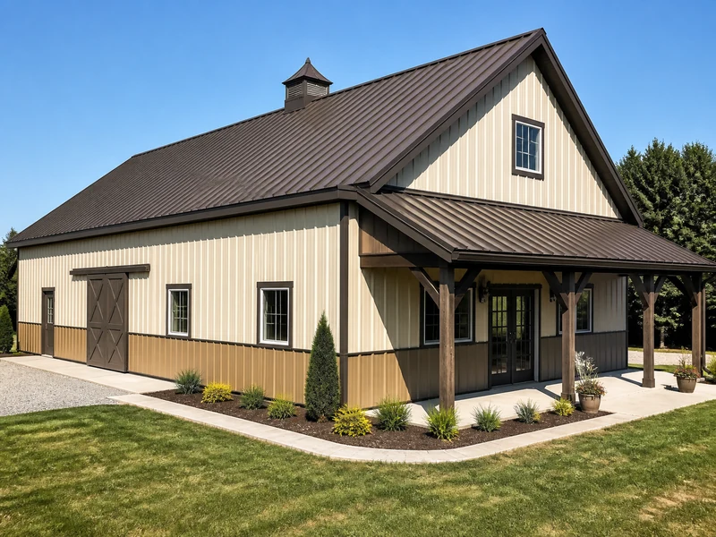
Light neutrals are the safest and most popular match for Burnished Slate because the strong value contrast lets the dark color frame the building cleanly. The dependable options are:
- White and off-white, including polar white and snow white, for the crispest, most classic contrast.
- Cream and ivory for a slightly softer, warmer version of white.
- Beige and tan when you want warmth without going dark.
- Light gray, ash gray, and dove gray for a cooler, more modern neutral.
- Light stone or almond as a middle-ground neutral that hides dust and pollen better than pure white.
These work whether Burnished Slate lands on the roof, the walls, or the trim, which is why the pairing suits homes, shops, and barndominiums alike. A common and forgiving setup runs light walls under a Burnished Slate roof with matching Burnished Slate trim, tying the top and the edges together while keeping the bulk of the building bright. The same dark gray-brown also reads well as a roof over a brick or stone facade, where it picks up the earth tones in the masonry. If you are choosing the roof first and the walls second, light neutrals give you the widest margin for error.
Warm Earth Tones for a Tone-on-Tone Scheme
Warm earth tones lean into the brown undertone and produce a quiet, low-contrast look instead of a bold one. Taupe is the easiest partner, since it bridges the gray and brown already in Burnished Slate and reads as a natural extension of it. Saddle or leather brown, koko brown, and sand all work in the same family, building a layered brown palette that feels grounded rather than flashy.
Because these colors sit close to Burnished Slate in value, the scheme can fall flat if every surface is a similar depth. Hold some separation by letting one element stay clearly lighter or darker, or by using texture, such as a stone or wood wainscot, to break up the brown. Tone-on-tone is the move when you want the building to settle into a rural or wooded setting instead of standing out from it.
Charcoal, Black, and Navy for Bold Contrast
Deep colors turn Burnished Slate into part of a dramatic, modern palette. Charcoal and charcoal gray are the most natural fit, since they pick up the cool side of the undertone for a moody, near-monochrome look. Black sharpens the whole building and works well when Burnished Slate sits as a slightly warmer roof or accent over black walls. Deep navy blue is the boldest option, reading rich and architectural against the gray-brown.
The one rule with dark-on-dark is value separation. When two deep colors sit too close in lightness, the design stops reading as intentional and just looks heavy. Give the eye a break with a lighter trim, a light wainscot, or bright accent doors. Muted greens such as sage, forest, or fern also hold up as an accent on doors or a single wall, bringing a natural note into an otherwise dark scheme.
Coordinating Burnished Slate Across Roof, Walls, Trim, and Wainscot
A metal building gives you several separate color positions, and a scheme reads best when you assign Burnished Slate a clear role in that set instead of spreading it everywhere. The positions you are usually choosing are the roof, the walls or siding, the trim at the corners and openings, the wainscot band along the lower wall, and the doors. Gutters and downspouts are a minor fifth choice. Each of these metal building components takes color on its own, so a finished scheme is really a set of coordinated choices rather than a single pick. A simple way to begin is the classic trio: one color for the walls, one for the roof, and one for the trim, then treat the wainscot and doors as optional accents. Picking your Burnished Slate from the broader set of metal building colors first, then building the rest of the palette around it, keeps the whole envelope coherent.
Wainscot is the band of paneling along the bottom few feet of the wall. It adds physical protection where the wall takes the most abuse, and it gives you one more color slot to work with. Burnished Slate makes a strong wainscot under light walls, grounding the building, or you can flip the idea and run Burnished Slate walls above a darker base. On a shop or barndominium, that lower band is often where owners add their boldest accent.
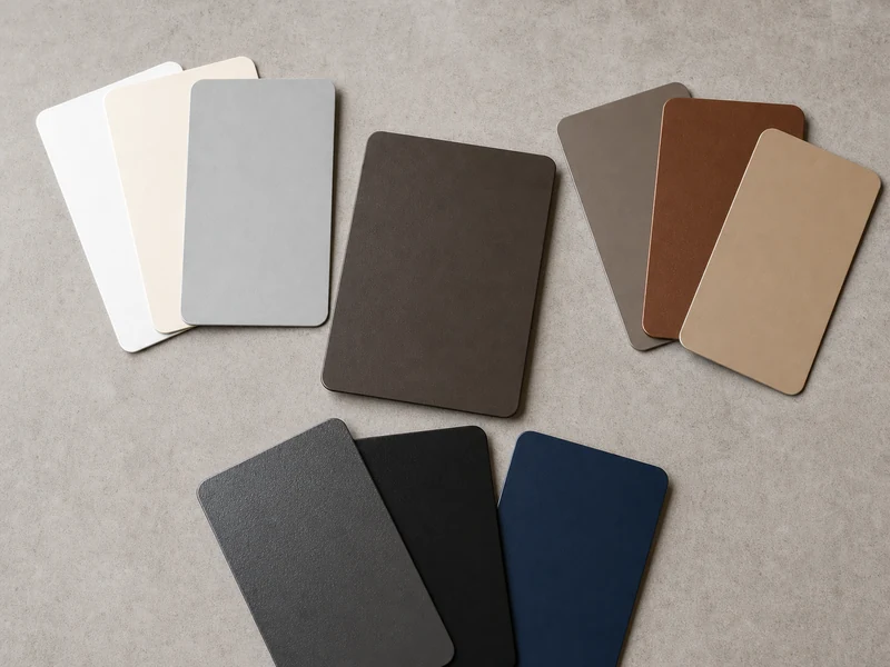
Real Burnished Slate Color Combinations
These combinations show how the same color behaves in different positions:
| Scheme | Walls | Roof | Trim or wainscot | Result |
|---|---|---|---|---|
| Light walls, slate top | Ash gray or light stone | Burnished Slate | Burnished Slate trim | High contrast, clean, low maintenance look |
| Slate walls, bright edges | Burnished Slate | Galvalume or light | Off-white trim | Warm body with crisp outlines |
| Warm tone-on-tone | Saddle brown | Burnished Slate | Burnished Slate or tan | Earthy, low contrast, rural fit |
| Dark monochrome | Black | Burnished Slate | Light trim or accent door | Modern, needs a light break |
Use these as starting points rather than fixed recipes. The right split depends on how much you want the building to stand out and which surface you want the eye to land on first.
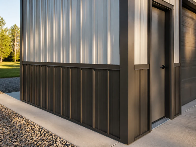
Mistakes to Avoid and How to Confirm Your Colors
One mistake shows up again and again: pairing Burnished Slate with a mid-gray that sits too close in value, which leaves the two colors competing and the scheme looking muddy. If you want gray, push it clearly lighter or clearly darker than the slate so the contrast looks deliberate. A second trap is assuming every brand’s Burnished Slate is identical. The name is nearly universal across panel suppliers, but the exact hue and how warm it reads can shift from one manufacturer to the next, so accessories sourced separately may not match perfectly.
Finish matters as much as the color name. The paint system and gloss level change how the same Burnished Slate reads, and a higher-sheen panel looks different from a low-gloss one in the same nominal color. If you are weighing coatings and how they age, our overview of metal building paint covers the durable systems used on steel panels. Color is not purely cosmetic on a roof either. Darker colors like Burnished Slate absorb more heat than light ones, and the U.S. Department of Energy notes that specially pigmented dark roofing can still reach roughly 30 to 60 percent solar reflectance, which matters if cooling load is a concern.
Before you commit, get a physical sample chip in the real coating, and ideally a piece of the actual panel profile. Then look at it on site in natural light at different times of day. A swatch under showroom lighting is the least reliable way to judge a dark, undertone-heavy color. If you are still settling the roof itself, our guide on how to pick a metal roof color walks through that step before you layer in the rest. For a custom building, our team can confirm Burnished Slate against the specific panels and finishes we fabricate, so the roof, walls, trim, and wainscot match the way you expect.
Conclusion
Matching Burnished Slate is less about finding one perfect partner color and more about choosing a direction and holding the contrast steady. Read the undertone first and decide whether you are going cool or warm. Then set the strongest contrast between your two largest surfaces, usually the walls and the roof, and save trim and wainscot for the accent that pulls the scheme together. Light neutrals give you the most room to be wrong, warm earth tones reward restraint, and deep colors demand a deliberate light break. Whichever way you lean, confirm the final palette on a real Burnished Slate panel in daylight before the order is placed. A dark gray-brown is exactly the kind of color that shifts most between a chip and a finished wall.
FAQ
Is Burnished Slate brown or gray?
Burnished Slate is a warm dark gray-brown, not strictly one or the other. It carries a gray, slate-like depth with a brown undertone, and it usually installs browner than a small swatch looks, especially in full sun.
What color siding goes with a Burnished Slate metal roof?
Light neutral siding is the most reliable match for a Burnished Slate roof. White, cream, beige, tan, and light or ash gray all give enough contrast for the roof to frame the house cleanly, while taupe offers a warmer, lower-contrast alternative.
What trim color goes best with Burnished Slate?
Off-white and light neutral trim give the cleanest outline against Burnished Slate walls or roof. Matching the trim to the Burnished Slate instead makes the edges recede and ties the building together, so the choice depends on whether you want corners and openings to stand out or blend in.
Does gray go with Burnished Slate?
Gray works with Burnished Slate as long as you separate the two in value. A light gray or ash gray contrasts cleanly, but a mid-gray that sits close to the slate’s depth tends to look muddy, so choose a gray that is clearly lighter or darker.
What gutter or downspout color works with Burnished Slate?
Gutters and downspouts blend in best when matched to the surface they run against, either the Burnished Slate trim or the wall color behind them. A contrasting gutter only helps when you want it to read as a deliberate line on the building.
Further Reading
- CRRC Rated Roof Products Directory (Cool Roof Rating Council). Look up the measured solar reflectance and SRI of a specific Burnished Slate panel by manufacturer and color when heat gain is a factor.
- Cool Roofs (U.S. Department of Energy, Energy Saver). Explains how roof color and solar reflectance affect how much heat a roof absorbs, useful context for choosing a dark color.
- Architectural Metal Coatings (PPG). Background on the PVDF and other coating systems that decide how a named color like Burnished Slate looks and how long it holds up.